An online menu has two jobs. It should make the food appealing enough to explore and make the decision clear enough to act on. When either side is missing, diners are left guessing—or they leave.
Large restaurant systems can spread these details across many screens. For a home cook or independent kitchen, a focused menu can be simpler and more useful. Seven pieces of information do most of the work.
1. A photograph that represents the actual dish
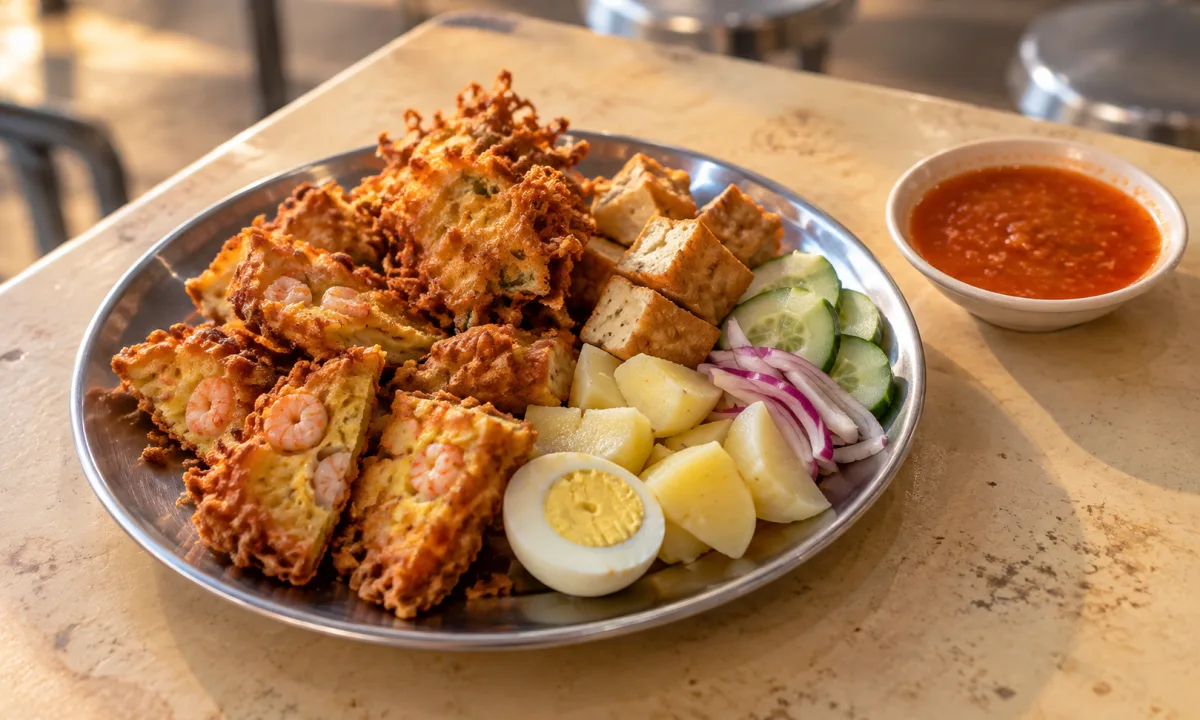
The image does not need to look like an advertising campaign. It needs to help a diner recognise what is being offered. Natural light, an uncluttered frame and a clear view of the food are often more useful than heavy styling.
Avoid using a generic image for several different dishes when that could create the wrong expectation. A menu works best when the photograph and the item beside it describe the same thing.
2. A specific, readable dish name
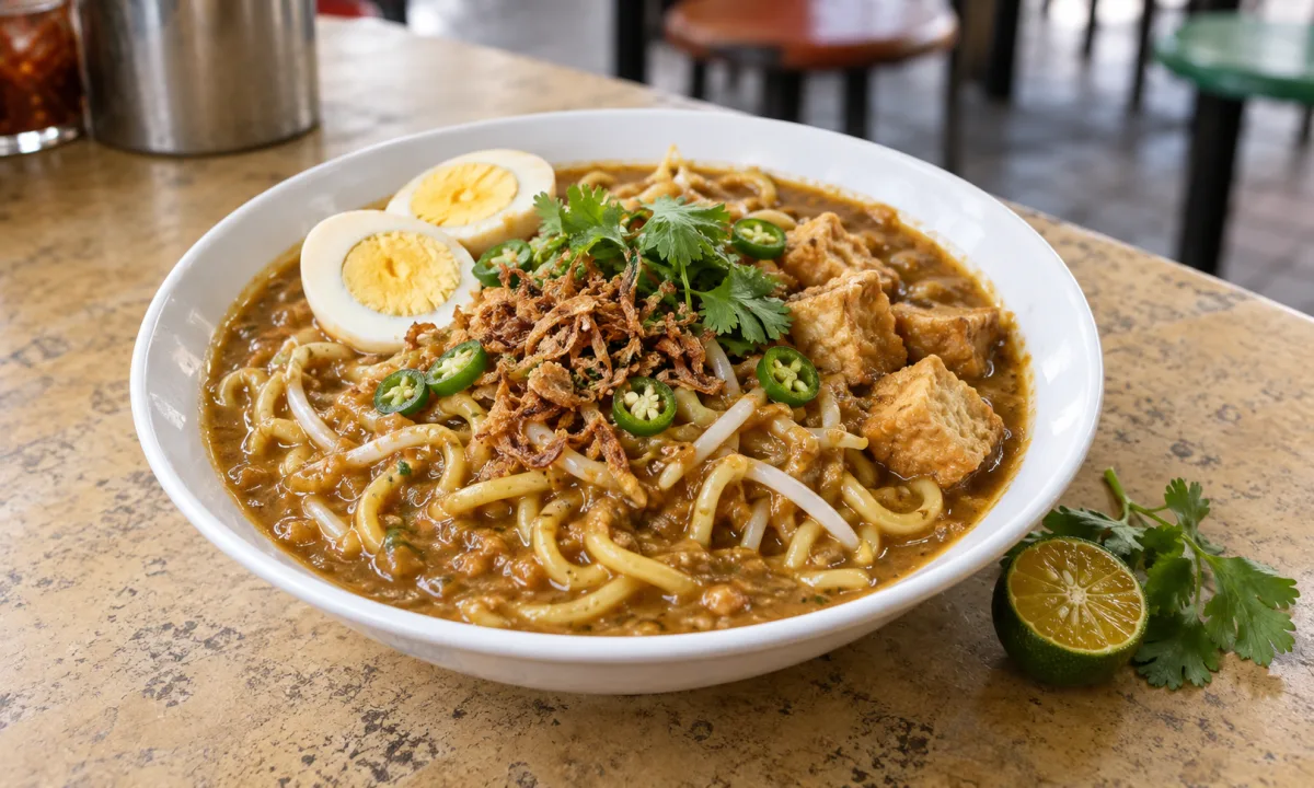
Names should be distinctive enough to find again and clear enough to understand at a glance. “Noodles” is broad; “Nyonya laksa with prawns and tofu” gives the diner a useful starting point.
Cultural or family names can remain part of the dish. A short explanatory phrase can help diners who are meeting it for the first time without flattening the story behind it.
3. A description that answers the first questions
A strong description tells the diner what the dish is made around, what makes this version notable and what arrives with it. It does not need to catalogue every ingredient in promotional language.
Think in practical terms: protein or main component, base, defining sauce or spice profile, important sides and any option the diner must select. Keep claims factual and avoid labels the kitchen cannot support.
4. Price with enough portion context
A price by itself can be difficult to interpret. Is it one portion, a sharing tray or a set with sides? Does the photographed garnish come with the dish? Are common additions included or optional?
The menu should make the base price clear and separate optional extras. Diners can then compare value without discovering the real structure only at the last step.
5. Preparation timing and real availability
Small-batch menus often depend on advance preparation, limited quantities or particular service days. That is useful information, not a weakness. Showing it early helps the right diner plan around the kitchen’s actual rhythm.
A current menu should distinguish what is available now from a past special or a dish that requires advance notice. Scheduled public-page refreshes should also remove deleted or ineligible content rather than leaving a soft 404 behind.
6. The service modes attached to the kitchen
A menu becomes actionable when the diner knows how the food can be received. Show pickup, delivery or dine-in only when the kitchen supports that mode. Do not add a delivery promise to every listing as a generic convenience.
Location information should match the context. A public restaurant can display an appropriate business address. A residential home kitchen should use a general area publicly and keep exact handover details within the private order journey.
7. Dietary and allergen information that stays precise
Dietary labels are useful only when they are accurate. A diner may interpret “vegetarian”, “halal”, “gluten-free” or “nut-free” as more than a flavour description. Kitchens should publish only the claims they can genuinely make and keep them current.
If an allergy matters to your safety, treat the menu as the beginning of the conversation rather than the final assurance. Confirm ingredients and cross-contact directly through the supported channel before ordering.
A quick menu review for diners and kitchens
Before publishing or ordering, read the menu once from the other side of the table. Can a new visitor understand the dish, the price, the timing and the way it can be received?
- The photograph and item name describe the same dish.
- The description explains the main components without unsupported claims.
- The base price, portion and optional additions are distinguishable.
- Preparation and availability are current.
- Service modes and public location detail are appropriate.
- Dietary information is specific enough to be meaningful.
Clarity makes the food more inviting
Minimal does not mean empty. A focused menu removes decorative friction while keeping the details that help a diner make a real decision. The photograph opens the door; clarity gives someone a reason to continue.
For diners, these seven checks make unfamiliar kitchens easier to compare. For cooks, they turn a small menu into a useful public introduction without pretending to be a giant restaurant catalogue.